$0.00
Colors Meaning
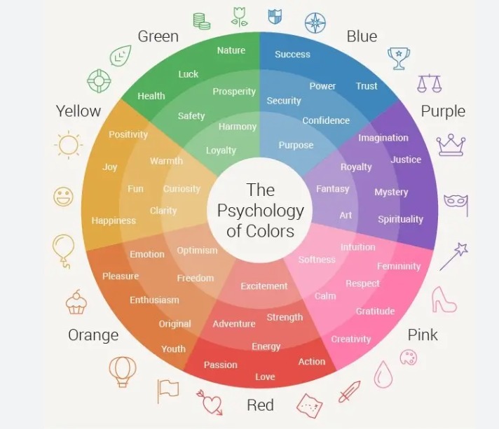
- Red: Red is often associated with passion, excitement, and energy. It can be used to create a sense of urgency or to draw attention to important information. Red is a popular color for logos and call-to-action buttons, as it can stimulate action and create a sense of urgency.
- Blue: Blue is often associated with trust, security, and stability. It can be used to create a sense of calm and to convey a feeling of professionalism or authority. Blue is a popular color for corporate logos, websites, and other business-related design elements.
- Yellow: Yellow is often associated with optimism, joy, and warmth. It can be used to create a sense of happiness and friendliness. Yellow is a popular color for brands that want to create a lighthearted, approachable image.
- Green: Green is often associated with nature, growth, and harmony. It can be used to create a sense of balance and tranquility. Green is a popular color for brands that are focused on sustainability, health, and wellness.
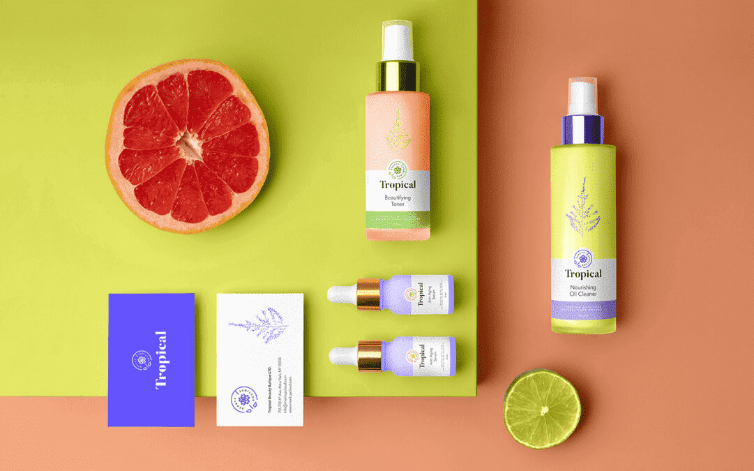
- Purple: Purple is often associated with luxury, creativity, and imagination. It can be used to create a sense of sophistication and exclusivity. Purple is a popular color for high-end brands, as well as brands in the beauty and cosmetics industry.
- Black: Black is often associated with power, elegance, and sophistication. It can be used to create a sense of authority and professionalism. Black is a popular color for luxury brands, as well as brands that want to create a strong, sophisticated image.
- White: White is often associated with purity, cleanliness, and simplicity. It can be used to create a sense of clarity and minimalism. White is a popular color for brands that want to create a clean, modern image.
When using color in design, it’s important to consider the meaning and psychological impact of each color, as well as how different colors can work together to create a cohesive and effective design. It’s also important to consider the context in which the design will be used, as well as the target audience and their preferences and perceptions of color.
Pastel colors
The perception of color is a complex process that involves the interaction between the eyes and the brain. The receptors in the human eye that are responsible for color perception are called cones, and there are three types of cones that respond to different wavelengths of light. Each cone type is most sensitive to either short, medium, or long wavelengths of light, which correspond to the colors blue, green, and red, respectively.
Pastel colors are usually created by mixing a brighter color with white, which results in a color that has a lower saturation or intensity. This means that pastel colors have a lower amount of pigment, and therefore, they reflect less light into the eye than brighter colors.
When pastel colors are viewed, the cones in the eye respond by sending signals to the brain, which then processes the information and interprets the color. Pastel colors are typically associated with calmness, relaxation, and gentleness, which may be why they have a soothing effect on the viewer.
Overall, the interpretation of pastel colors by the receptors in the eye is similar to that of other colors, but their lower saturation and intensity can create a unique visual experience that is perceived as gentle, calming, and peaceful.